Consulting & agencies
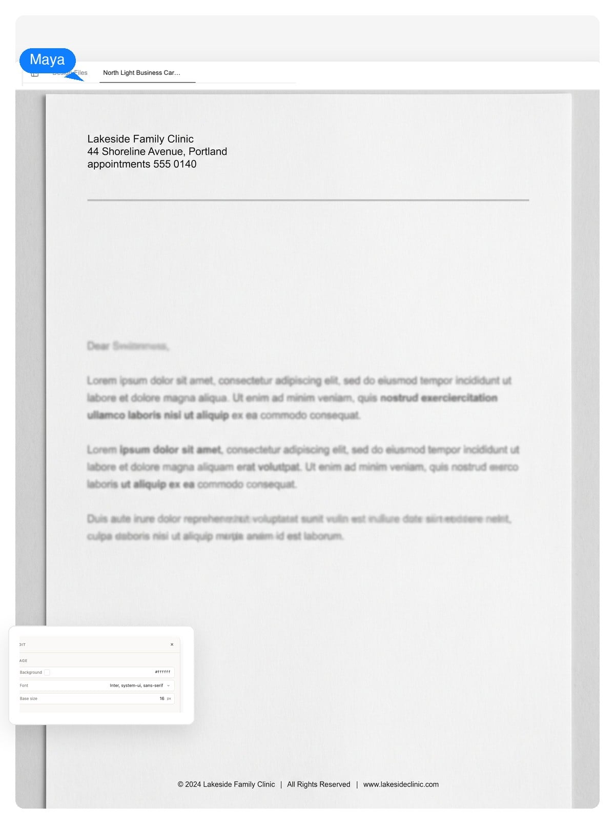
Left-aligned header, a single confident rule, generous white space. It reads organized before a word is read — which is the product a consultancy sells.
Generate a professional letterhead from a short description of your business. You get a layered design — header, address block, and footer stay editable text — sized for A4 or US Letter print.
Editable, layer by layer
Most generators hand you a flat image. If the phone number changes, you start over. Here the letterhead is a layered design — the parts a business actually updates stay editable.
Company name, address, phone, registration line — you edit them like text, because they are text. A new suite number doesn't mean a new design.
The wordmark, the rule, the contact block — click any element and change just that. Export a layered PSD and each element arrives as its own layer.
Save the palette, type, and logo as a brand kit. The next document you generate — an invoice, a business card — starts from the same system instead of from zero.
Brand color, propagated
A letterhead isn't colored in one place — the accent shows up in the monogram, the header rule, the footer band. Tap a palette and watch one decision carry through the design.
One palette choice recolors:
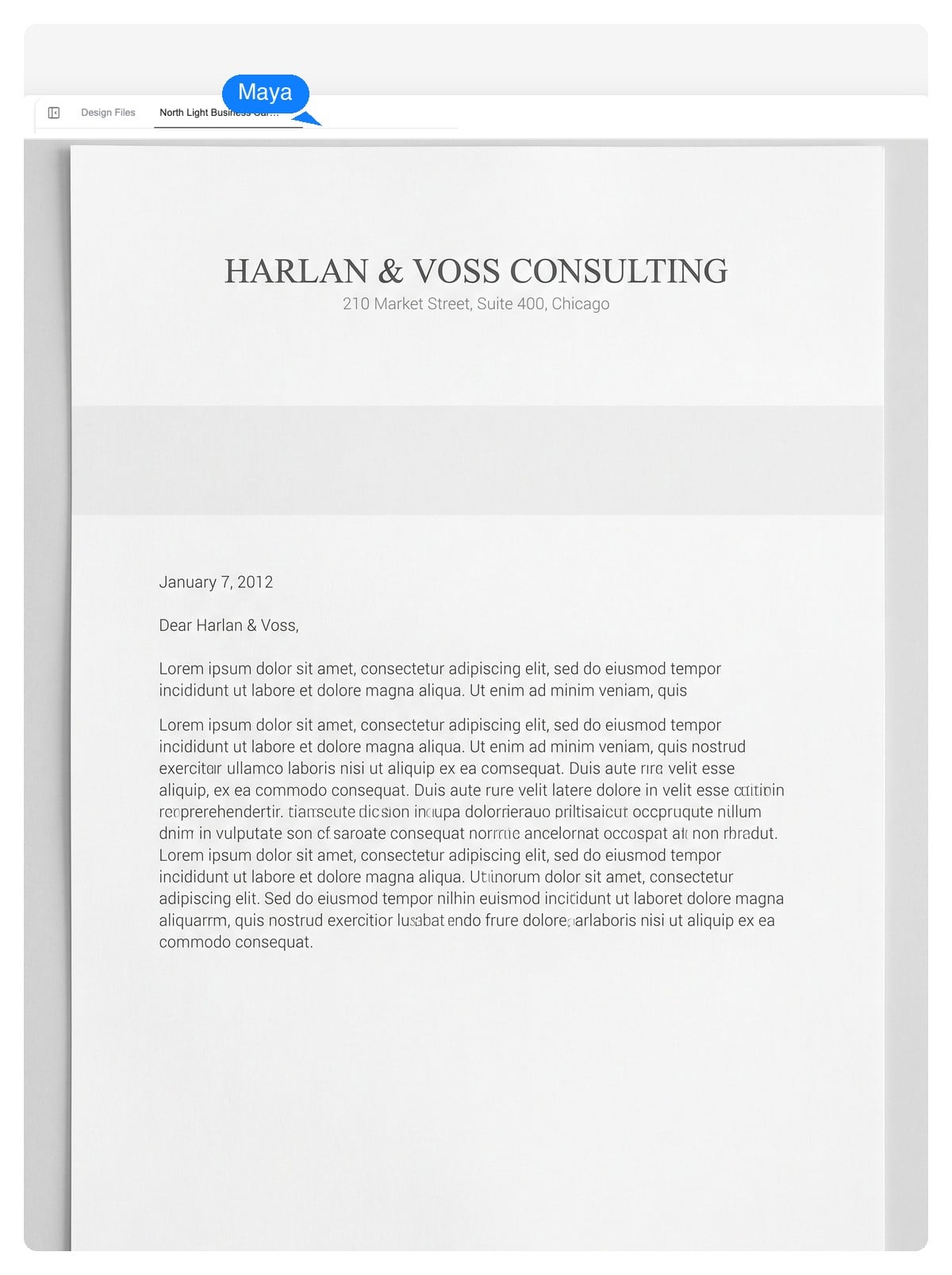
This preview is a static demonstration. In the product, the same idea is a brand kit: set your colors once and every letterhead, card, and invoice you generate after that carries them.
Name, address, phone, industry, and the tone you want — conservative, modern, warm. Paste your real contact details; they'll be laid in as editable text.
The agent composes the letterhead on a true A4 or US Letter canvas — wordmark, header, rule, footer — each element on its own layer. It takes a few minutes, and it's designing, not filling a template.
Ask for changes in plain language or click an element to edit it. Download a print-ready PDF, a native-size PNG, or a layered PSD.
Craft, not decoration
A letterhead has one job: make the letter read like it comes from a real organization. These five mistakes are what break that impression — worth checking whatever tool you use.
Because the output is layered, fixing any of these is a one-line edit — shrink the header, swap the typeface, mute the color — without regenerating the design.
Different fields carry different conventions — a law firm's stationery should not look like a startup's. Each starting prompt below bakes those conventions in; the sketch previews the layout it asks for.
Left-aligned header, a single confident rule, generous white space. It reads organized before a word is read — which is the product a consultancy sells.
Centered serif wordmark, thin rule, partners' names set small in the footer. Conservative on purpose: in legal correspondence, novelty costs trust.
Soft accent, the appointment phone easy to find, registration number in the footer. Warmth and legibility over flair — patients read these under stress.
Bold wordmark, warm accent, license number where regulations expect it. Confident but grounded — clients are about to trust you with a lot.
A small emblem, warm palette, donation contact in the footer — often a board list in the margin. Credibility does the heavy lifting on fundraising letters.
A monogram, one thin line, your name set well. Personal letterheads win by restraint — you are the brand, the paper just frames it.
The anatomy
A letterhead is the printed header — and usually footer — that identifies your organization on official correspondence. This is the checklist worth running before you call the design done.
Top of the page, sized with restraint. If you have both a mark and a wordmark, pick one to lead — both at equal weight splits attention.
The registered name, not just the trading name, on documents with legal weight — contracts, offers, formal notices.
Street address in the header or footer, structured as a column or one divided line. Remote-first companies still put the registered address on official paper.
Phone, email, website — the ones you actually answer. Three well-chosen items beat six that route nowhere.
Many jurisdictions require the company registration or tax number on business letters — common across Europe, rare in US practice. Check your local rule and give it a quiet footer line.
Disclaimers and registration details live in the footer. Page-two convention: drop the full header and keep a slim rule or footer, so continuation sheets still look owned.
A letterhead is a print object first. These are the numbers that matter when the design leaves the screen — and exactly what you can download.
| US Letter | 8.5 × 11 in — 2550 × 3300 px at print resolution |
|---|---|
| A4 | 210 × 297 mm — 2480 × 3508 px at print resolution |
| Print resolution | 300 DPI, so type and logo edges stay crisp on paper |
| Typing area | Keep ~25 mm / 1 in side margins; header band under ~50 mm / 2 in |
| Export formats | Print-ready PDF, native-size PNG, layered PSD |
| Second sheet | Continuation pages conventionally drop the full header and keep a slim rule or footer |
One system, many documents
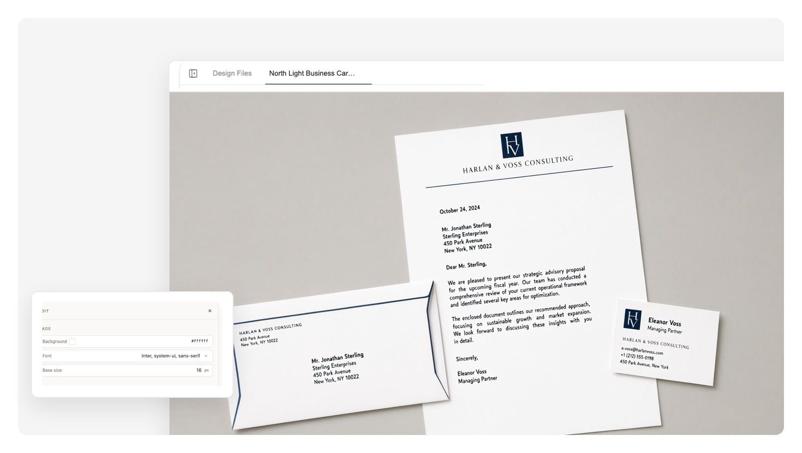
The same identity has to hold when the letter arrives with a business card clipped to it, or an invoice in the same envelope. That's the case for doing this as a design system, not a one-off file.
Save your letterhead's palette, type, and logo as a brand kit, and the next document starts from it. Same wordmark, same accent, same footer discipline — generated from one system, not reassembled by hand.
Build the rest of the suite:
Yes — describe your organization (name, address, industry, tone) and the design agent composes a letterhead on a real A4 or US Letter canvas. The difference from a template site: the result is a layered design you keep editing, not a fixed file you fill in.
An editable design. Header and footer content is real text — change the address or phone without regenerating — and every element (wordmark, rule, contact block) sits on its own layer you can click and adjust.
The canvas is set up for A4 (210 × 297 mm) or US Letter (8.5 × 11 in). Export a print-ready PDF, a native-size PNG, or a layered PSD where each design element arrives as a separate layer.
Yes. Attach your logo and name your colors and typefaces, and the design is built around them. You can save the result as a brand kit so future documents reuse the same system automatically.
No — there's no .docx export, and we'd rather say so than pretend. Teams that write letters in a word processor usually export the PNG and place it in their document template's header, or write on the PDF version directly. Designers take the layered PSD.
Gather the facts first: legal name, address, contact line, and any registration number your jurisdiction requires on business letters. Describe them to the generator along with a tone — conservative, modern, warm. Then review, adjust details in chat, and export at the size you print on.
Logo or wordmark, legal company name, address, and a contact line — plus a registration or tax number where local law requires it (common in Europe, rarer in the US). Keep the header under about 2 inches so the letter itself stays the subject.
It's free to start, with no credit card to begin. You can generate a letterhead, iterate on it in chat, and export — enough to know whether the design earns a place on your correspondence.
Yes. Print services ask for a correctly sized PDF at 300 DPI — which is what the export produces, at true A4 or US Letter dimensions. No rescaling or reformatting step in between.
That's what the brand kit is for: the palette, type, and logo you settle on here carry over to the next document you generate. The suite reads as one identity because it's produced from one system.
Describe your company, get a layered letterhead design, and export it print-ready — A4 or US Letter, as PDF, PNG, or layered PSD.