Arched text
The classic banner arc — a steady rise with even spacing and room for a small illustration underneath. The default for signs, badges and celebration prints.
Type a word, describe a style, and get a finished typographic piece — arched or circular text, 3D chrome, retro 90s looks, floral lettering. It arrives as a layered design where the word itself is still editable text, not pixels.
Still text, not pixels
Call it word art or text art — most tools that make it flatten everything into one image the moment you export. Here the piece is built as a layered design: lettering, background and decoration stay separate, and the word itself stays live text.
Made it say EMMA and the party turns out to be for AVA? Edit the text layer and the style, curve and layout carry over — no starting from scratch, no cloning letters in a photo editor.
The background is its own layer, so you can swap concrete for linen paper without touching the lettering. Same for the decorations: ask for fewer flowers and only the flowers change.
Export a layered PSD and every element arrives on its own layer — hand the file to a client or a print shop and it's still editable, months later.
Same word, four ways
Range is the real test of a word art generator. All four of these started from the same five letters and the same prompt shape — only the style description changed.
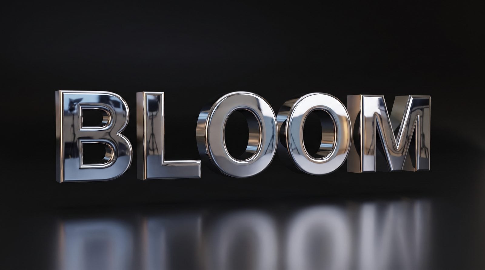
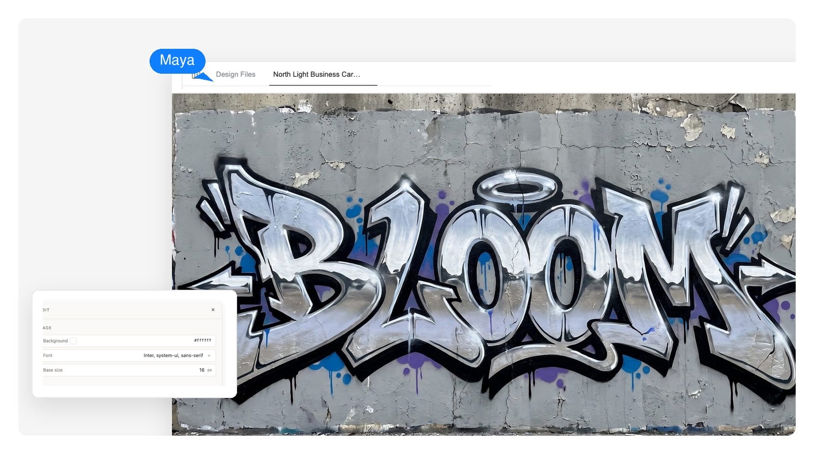
Mirror-finish 3D lettering with studio reflections — the showpiece treatment for posters and title cards.
Tap a style, or use the arrow keys, to switch the preview.
Curved text generator, built in
Ask for the shape in plain words: arch it over the sun, wrap it in a full circle, let it ripple. The letters are set along the path with the spacing corrected where curves usually break it — and the rest of the design is built around the bend.
The classic banner arc — a steady rise with even spacing and room for a small illustration underneath. The default for signs, badges and celebration prints.
A full ring of words around a center mark — stamps, seals, monograms. Say what sits in the middle and how tight the ring should be.
Letters riding a gentle wave — looser and friendlier than an arc. Right for beach, music and kids' themes where a straight baseline feels stiff.
There's no such thing as a curved font file — the bend is applied to the letters, not stored in them. Describe the mood and the curve, and the lettering is drawn to match, re-kerned along the path.
Building a round badge logo rather than a wall piece? Circle text is the backbone of that style too — the AI logo generator walks that route.
3D text effects
A 3D text generator usually means one preset bevel, or a week learning modeling tools. Here you describe the material and the light, and the depth, reflections and background are designed together — so the render reads as one piece instead of a sticker on a backdrop.
Honest scope: you get a high-resolution image of dimensional lettering, not a 3D model file you can rotate.
Mirror surfaces sell depth fastest — the reflections do the work. Strong for gym walls, garages and music pieces.
Soft, rounded, toy-like volume — the friendly end of 3D. Birthday prints, kids' rooms, product drops.
Flat face, deep body — the poster classic. It reads at any size because the front of the letters stays graphic.
Retro & 90s styles
If you learned computers in a school lab, you already know these: rainbow gradient fills, chunky bevels, hard drop shadows, words bent into arcs and flags. That one-word wordart you typed as a kid has aged into a real style family — half joke, half genuinely great print.
The difference now is that you're not picking from a fixed gallery of presets. Ask for a glossy rainbow arch, slightly dated on purpose, and you get the nostalgia with clean edges at print resolution — or push it sideways into Y2K chrome, vaporwave gradients or early-web pixel type.
Type the word or phrase, then describe style, colors and where it will live: BREATHE, thin serif, arched, dusty blue, framed print above a bathtub. Plain language is enough.
Not a font swap — it draws the lettering, sets the curve, builds the background and stacks everything as separate layers on one canvas. A finished design takes a few minutes.
Change the word, recolor a layer, swap the background in chat. Then download a native-size PNG, a layered PSD, or a PDF sized for print.
Most word art ends up printed. These are the four places it goes most, each with a starting prompt worth stealing.
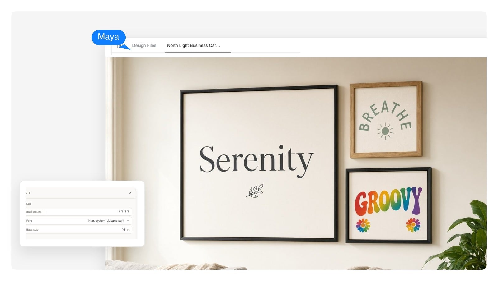
One good word above a couch does more than a cluster of small frames. Pick the frame first and set the canvas to its ratio — 8×10 and 11×14 are the safe standards.
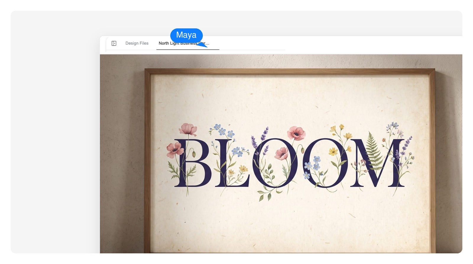
Door signs, word walls, reading-corner banners. High contrast and simple letterforms survive being read from the back row — save the ornate styles for close-up pieces.
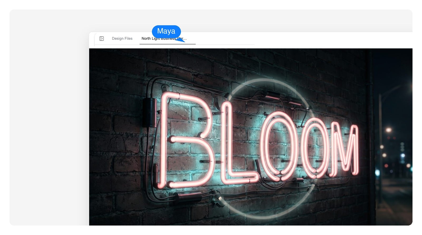
A name for a birthday table, CHEERS over the bar cart, a seat-yourself sign for a wedding. Match the invitation's palette and the whole set reads art-directed.
Shirt fronts, tote prints and sticker sheets start as word art. Export the layered PSD so the print shop can lift the lettering off the background and place it on the garment template.
When the piece needs more than a word or two: AI poster generator · AI invitation maker · AI banner generator
Word art fails at print time more often than at design time. Short version: pick the physical size first, set the canvas ratio to match, and export at native size — the 4K export renders the same layout at higher pixel density for larger prints.
| Canvas ratio | Anything — square, portrait, landscape; 4:5 and 2:3 match standard frames |
|---|---|
| 8×10 in frame, 300 DPI | 2400 × 3000 px |
| 11×14 in frame, 300 DPI | 3300 × 4200 px |
| 18×24 in poster, 150 DPI | 2700 × 3600 px — 150 DPI holds up at poster viewing distance |
| A4 sheet (210 × 297 mm), 300 DPI | 2480 × 3508 px |
| Export formats | PNG at native size (4K-density export available), layered PSD, PDF for print |
The craft part
Five habits separate a piece someone frames from one that reads as clip art. The generator is tuned to avoid them — and they're the vocabulary to use when you give feedback in chat.
When a draft breaks one of these, name it in chat — “close the gaps on the curve”, “drop the glow” — and that layer gets redone, not the whole piece.
You give it a word and a style description; it designs a complete typographic piece — custom lettering, a curve if you asked for one, background and decoration — arranged as separate layers on one canvas. That's the difference from classic word art makers online, which fill your text into a fixed set of preset styles.
Yes. The word lives on an editable text layer, so you can re-word the piece — fix a typo, swap EMMA for AVA — and the lettering style, curve and layout carry over. Nothing regenerates unless you ask.
Yes — describe the path in plain words: arched over the illustration, wrapped in a full circle, rippling like a wave. Spacing is corrected along the bend. If you've been searching for a curved font, this is usually the actual need: normal letters set on a curved path, with a design built around them.
Chrome, brushed metal, inflated balloon and extruded styles all work — described in words, rendered with consistent lighting and reflections. To be clear about scope: the result is a high-resolution image of dimensional lettering, not a 3D model file you can rotate or import into a game engine.
PNG at the canvas's native size, a 4K-density export of the same layout for larger prints, a layered PSD, and a PDF sized for print. There's no SVG or vector export — if you need cut files for a vinyl cutter, this isn't the right tool for that job.
Export the layered PSD and hide the background layer — the lettering and decorations sit on their own layers, so they lift cleanly in any editor that opens PSD files. That's the reliable route when you want the word placed over your own photo or product shot.
Yes — name the colors in the prompt, as precisely or as loosely as you like: dusty sage, warm cream, ink navy. Exact commercial fonts can't be promised; the AI draws custom lettering in the spirit you describe instead, which is usually what a one-word piece wants anyway.
Designs you generate are yours to use commercially — print sales, market stalls, client work, apparel drafts. One honest caveat: if the word itself is someone's trademark or a lyric, clearing that is on you. The tool designs the piece; it doesn't clear rights.
Work back from the frame: 300 DPI for pieces viewed up close — 2400 × 3000 px for an 8×10 — while 150 DPI is fine for posters seen from a distance. Set the canvas ratio to the frame before generating, then use the native-size or 4K-density export rather than upscaling a small file.
The usual failures are stretched letters, too many effects stacked, and spacing that falls apart on a curve. Because the piece is layered, you fix the specific fault in chat — “re-space the letters on the arc”, “drop the outer glow” — instead of re-rolling the whole design and hoping.
Start with the word and the room it's going in. Style is easier to choose once you can see the piece a few different ways — and cheaper to change while the text is still text.