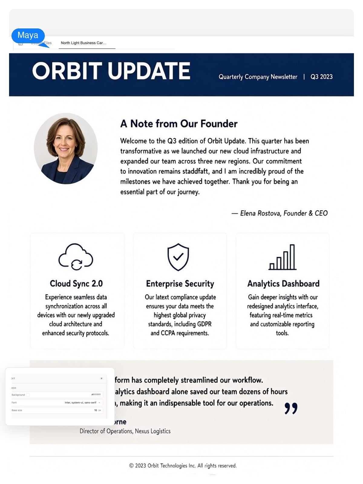
Company & customer updates
A monthly digest people actually open: founder note, product news, one customer story. Keep the masthead and section order identical every issue — recognition is the whole game.
Describe your issue once — this newsletter maker writes the first draft and lays it out as a real design: masthead, story blocks, images, footer, all at true email width. Click anything to change it, then export a web page, PDF, or print-ready pages.
A design, not a picture
The generator doesn't hand you one flat image with your words baked in. A newsletter here is built from parts — masthead, headlines, story blocks, image slots, footer — and every part stays editable after the first pass.
Fix a typo, rename a section, or rewrite a paragraph directly in the design. You never regenerate the whole issue because one word changed.
Select the masthead, an image, or a story block and adjust it on its own. The rest of the layout holds still.
Say 'tighter spacing', 'swap the story order', or 'calmer colors' in chat, and the same design updates — not a new random one.
 Masthead — editable textImage slot — regenerate or replaceButton — its own element
The 600-pixel truth
Inboxes have rendered newsletters in a content column around 600px wide for two decades. A page laid out in a word processor falls apart in that column — so this generator designs inside it from the first draft, and re-stacks everything to a single column on phones.

600px content width — the desktop email column
This is the whole trick: design at 600px from the start and the issue survives every inbox, every forward, and every phone. Design at page width and it never will.
Say who it's for, which sections you need, and the tone — or paste rough notes and bullet points. The AI writes the first draft of headlines and body copy for you.
It comes back as a real newsletter design at email width: masthead, lead story, section blocks, image slots, and a footer, with a visible hierarchy instead of one long column of text.
Click any element to adjust it, or ask for changes in chat. When the issue reads right, export it as a standalone web page, a print-ready PDF, or a PNG.
Design honesty
It's usually not the writing. These five layout mistakes sink more issues than any subject line — the generator is tuned to avoid them, and they're worth checking in anything you send.
None of this is secret. It's the difference between a newsletter someone laid out on purpose and a document that got exported — and it's what the generator is prompted to get right on the first pass.
The same maker handles a customer digest and a classroom bulletin — what changes is the structure you ask for. Steal these starting points.
A monthly digest people actually open: founder note, product news, one customer story. Keep the masthead and section order identical every issue — recognition is the whole game.
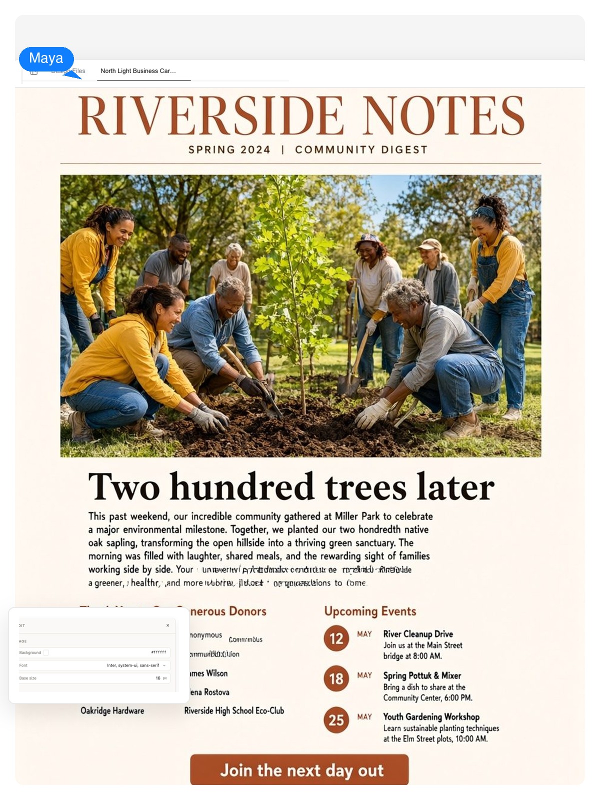
Lead with one impact story and one big photo, not twelve announcements. Supporters read the first block — put the thank-you and the single call to action right after it.
Name it, give it a masthead, and hold a fixed rhythm of sections — wins, people, dates. Internal comms live or die on skimmability.
Parents read between things, on phones. Single column, a big dates box, one photo strip, one sign-up link.
A hero photo, three captioned highlights, sponsor thank-yous, and next year's date — sent while the event is still warm.
Stats up top, two featured listings, one neighborhood story. A consistent monthly design builds the credibility the listings trade on.
Announcing a single date rather than a running series? Try the one-page AI flyer maker instead — it travels better on a noticeboard. And the AI brochure maker handles folded print pieces.
Worth knowing whether you design here or anywhere else. The generator applies them by default; print runs use standard page sizes through the PDF export.
| Email content width | 600px — the column most inboxes render; designs here are laid out at this width from the start |
|---|---|
| Phone viewport | 320–430px — multi-column sections stack to a single column |
| Image resolution | Twice the slot width — about 1200px for a full-width image — so photos stay sharp on high-density screens |
| Body text size | 14–16px minimum; smaller gets pinch-zoomed or skipped on phones |
| Print page sizes | A4 (210 × 297 mm) and US Letter (8.5 × 11 in) via the paged PDF export |
| Export formats | Standalone web page (HTML), print-ready PDF, PNG image |
Both, here. Text generators give you prose you still have to lay out somewhere. This one returns a designed issue — masthead, lead story, section blocks, image slots, footer — at email width, and the design stays editable element by element. The writing is the start of the job; the layout is most of it.
For email, design at 600px wide — the content column most inboxes render — and let sections stack to a single column on phones. For print, use A4 or US Letter through the PDF export. This generator uses those defaults unless you ask for something else.
The export is a standalone web page, a PDF, or a PNG — not a tested email template, and this tool doesn't send mail. The common pattern: host the web page and link it from a short note, attach the PDF, or rebuild the layout inside your sending tool using the design as the spec. Because it's designed at 600px, it translates cleanly.
Yes — that's the point of it being a design rather than a picture. Headlines and body copy stay editable text, images sit in their own slots you can regenerate or replace, and you can select any element to adjust just that part. For bigger moves, describe the change in chat and the same layout updates.
It writes a first draft from whatever you give it — a topic, rough notes, bullet points — including headlines, section copy, and captions. Treat it as a draft: check names, dates, and numbers before sending, because you're still the editor.
Tell it to. Describe the masthead, colors, and section order you settled on — or ask it to reuse last issue's design with this month's content. A newsletter earns recognition by looking the same every time, so lock the layout early and only swap the stories.
Both. The paged PDF export lays the issue out on real page sizes — A4 or US Letter — for print, while the web page and PNG exports cover digital. School bulletins and community newsletters often go out both ways from the same design.
It can write one — a solid draft, even. But a newsletter is a layout at a fixed width, not a block of prose, so you'd still paste that text into a design tool and do the layout work there. Here the writing and the design happen in one place, and what you get back is an editable design.
One lead story with a real headline, a visible hierarchy after it, one type family, images sized to their slots, and a single prominent call to action. The five mistakes listed above are the same list inverted — get those right and you're ahead of most of what lands in an inbox.
You do. Newsletters you design here are yours to use for your company, school, nonprofit, or clients, including commercial use. If you include photos, logos, or text you didn't create, clearing those stays your responsibility, same as in any design tool.
Describe who it's for and what's inside. Get a newsletter laid out at real email width, edit it in place, and ship it as a web page, PDF, or print.