Flows, made visible
Sankey Diagram Generator, paste your flows, see where everything goes.
A sankey diagram shows how a quantity splits and flows — money, energy, users. Paste a source–target–value table or describe the flows in a sentence, and the generator draws the sankey chart for you.
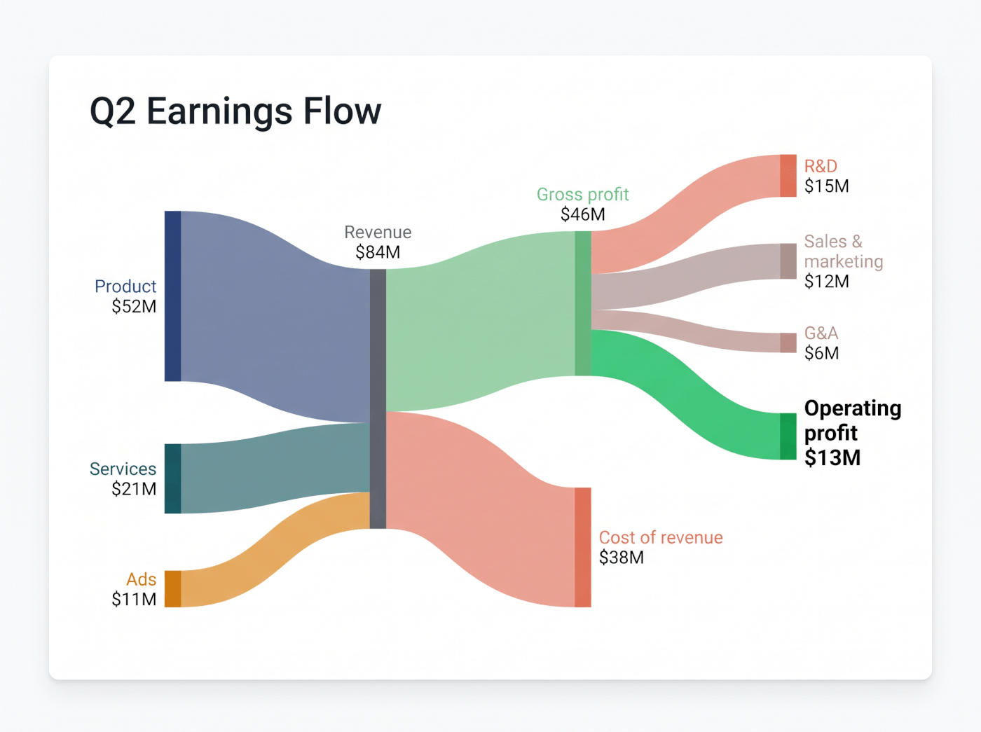
An earnings flow like this takes one pasted income statement.
What is a sankey diagram?
A sankey diagram is a flow chart where the width of each band is proportional to the quantity it carries. Wide bands mean big flows, thin bands mean small ones — so you can see at a glance where money, energy, users, or materials come from and where they end up.
Sankey charts shine wherever something splits or merges: how revenue breaks into costs and profit, how a marketing budget spreads across channels, how visitors move through a funnel, or how energy flows from sources to uses. If your data has a from, a to, and an amount, it can be a sankey.
Sankey diagram examples
Anything that flows works — money, users, energy, time. Two favorites:
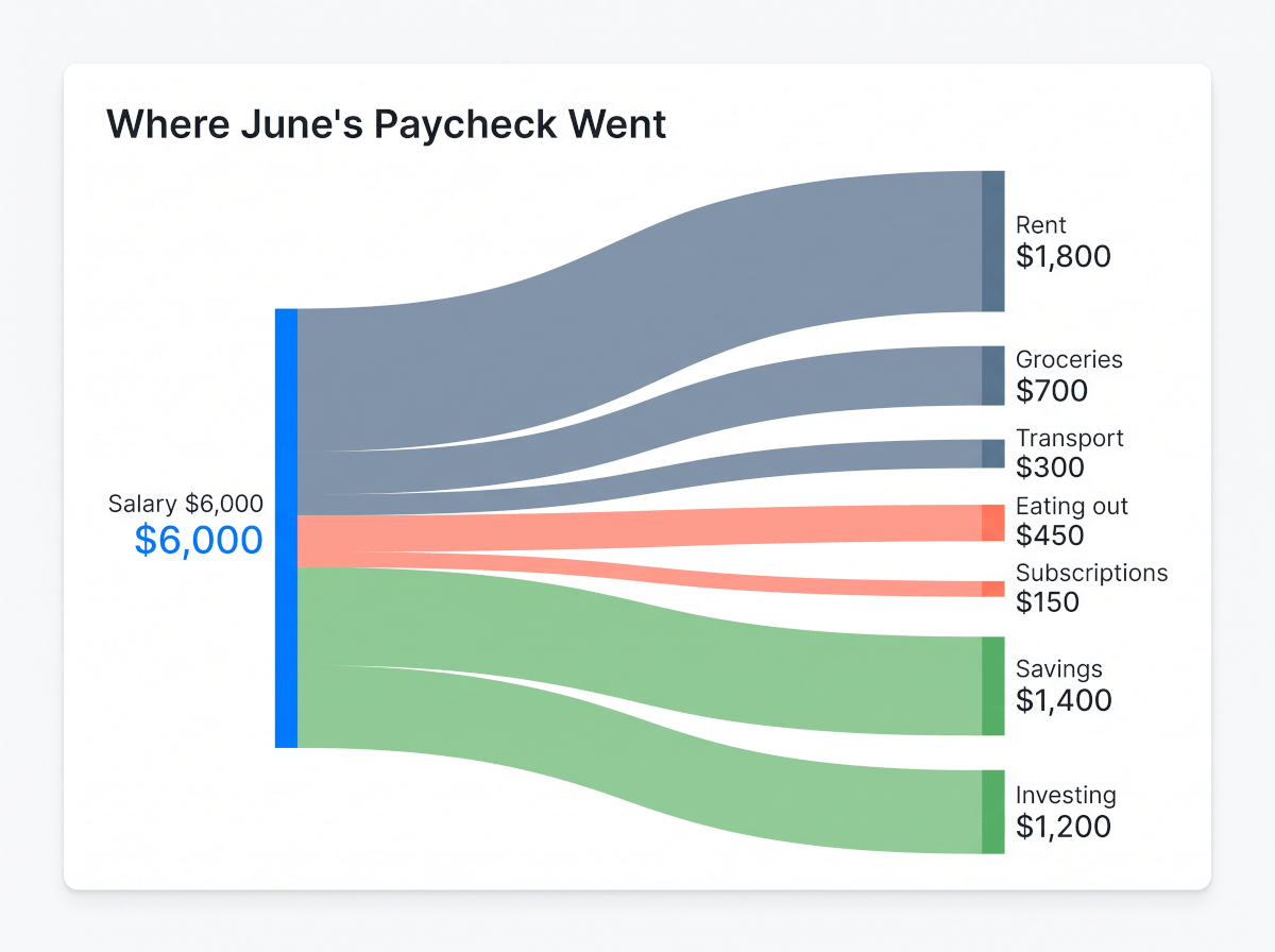
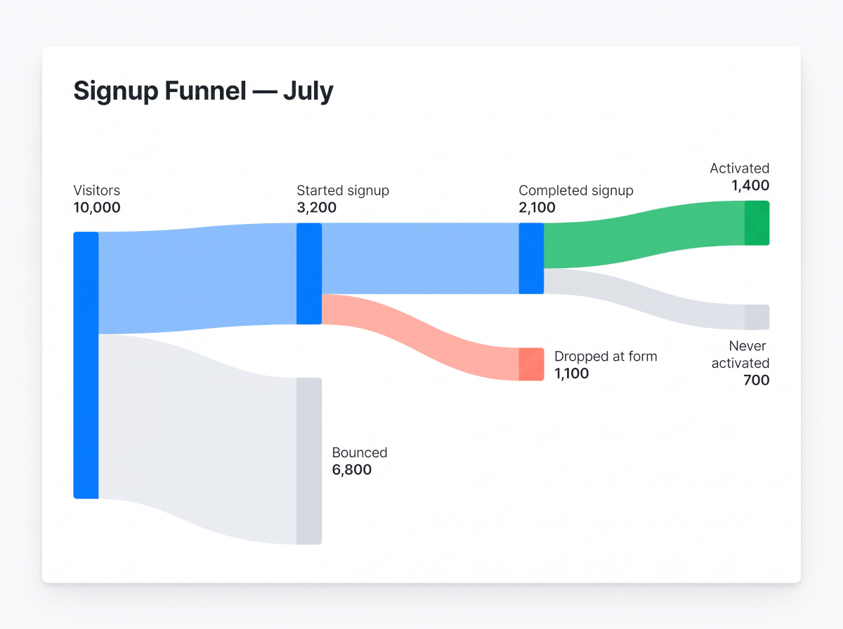
From a financial report to a money-flow sankey
The classic earnings-visualization sankey — revenue fanning out into costs, margins, and profit — is built in. Paste an income statement or point at a company's financials, and the flows are extracted and drawn as a clean sankey diagram, ready to drop into a report.
Comparing values instead of tracing flows? The AI chart generator covers bar, line, and pie charts — and for boxes-and-arrows process drawings there's the AI diagram generator.
How to create a sankey diagram
No node-and-link syntax to learn — start from the data you already have.
1Paste flows or describe them
Rows of source, target, and amount from a spreadsheet work as-is. So does a plain sentence like "income splits into rent, food, and savings".
2The generator draws the sankey
Nodes are placed, band widths are scaled to your values, and labels land where they're readable — the layout math is handled for you.
3Refine and export
Rename nodes, recolor bands, or add a missing flow with one instruction. Download the sankey chart as an image for your report or deck.
Been fighting a sankey diagram in Excel? There's no native chart type for it there — paste the same rows here instead and the diagram draws itself.
Built for real flow data
The fiddly parts of sankey charts — handled.
From a pasted table
Source–target–value rows from any spreadsheet become nodes and proportional bands, with totals checked so the flows actually add up.
Or from plain words
No table yet? Describe the flows the way you'd explain them and the generator structures the sankey for you — you can swap in exact numbers later.
Readable by default
Band colors, node order, units, and labels are set for legibility, and every one of them can be changed with a sentence.
Ready for your report
Export the sankey diagram as a crisp image and drop it into a slide, a doc, or a dashboard write-up.
Frequently Asked Questions
How do I create a sankey diagram from my data?
Give the generator your flows in either form: a pasted table with source, target, and value columns, or a plain-language description like "revenue splits into costs and profit". It builds the nodes, scales the band widths to your numbers, and labels everything.
What's the difference between a sankey diagram and a sankey chart?
Nothing — sankey diagram, sankey chart, and sankey graph all name the same visualization: flows drawn as bands whose width is proportional to the amount they carry. This generator builds all of them the same way.
Can I make a sankey diagram from Excel data?
Yes — copy the rows straight out of your spreadsheet and paste them in. Excel itself has no built-in sankey chart type, which is exactly why pasting the data here is the fastest route from spreadsheet to diagram.
Can it turn a financial report into a sankey diagram?
Yes, that flow is built in: paste an income statement or reference a company's earnings, and the revenue-to-profit money flow is extracted and drawn as a sankey — the same style of visualization you see in earnings breakdowns online.
Can I customize the colors, node order, and labels?
Yes. Ask for changes in plain words — recolor a band, rename or reorder nodes, add units, split a flow — and the diagram redraws without you starting over.