Data to chart in seconds
AI Chart Generator, from raw numbers to a clean graph.
Paste a data table or describe what you want to show. The AI graph generator picks the right chart type, draws it, and hands you an editable chart — ready for your report or deck.
Charts on this page are illustrative — generate your own in seconds.
One AI chart maker, every chart type
Ask for the chart by name, or let the AI choose what fits your data best.
Bar graph
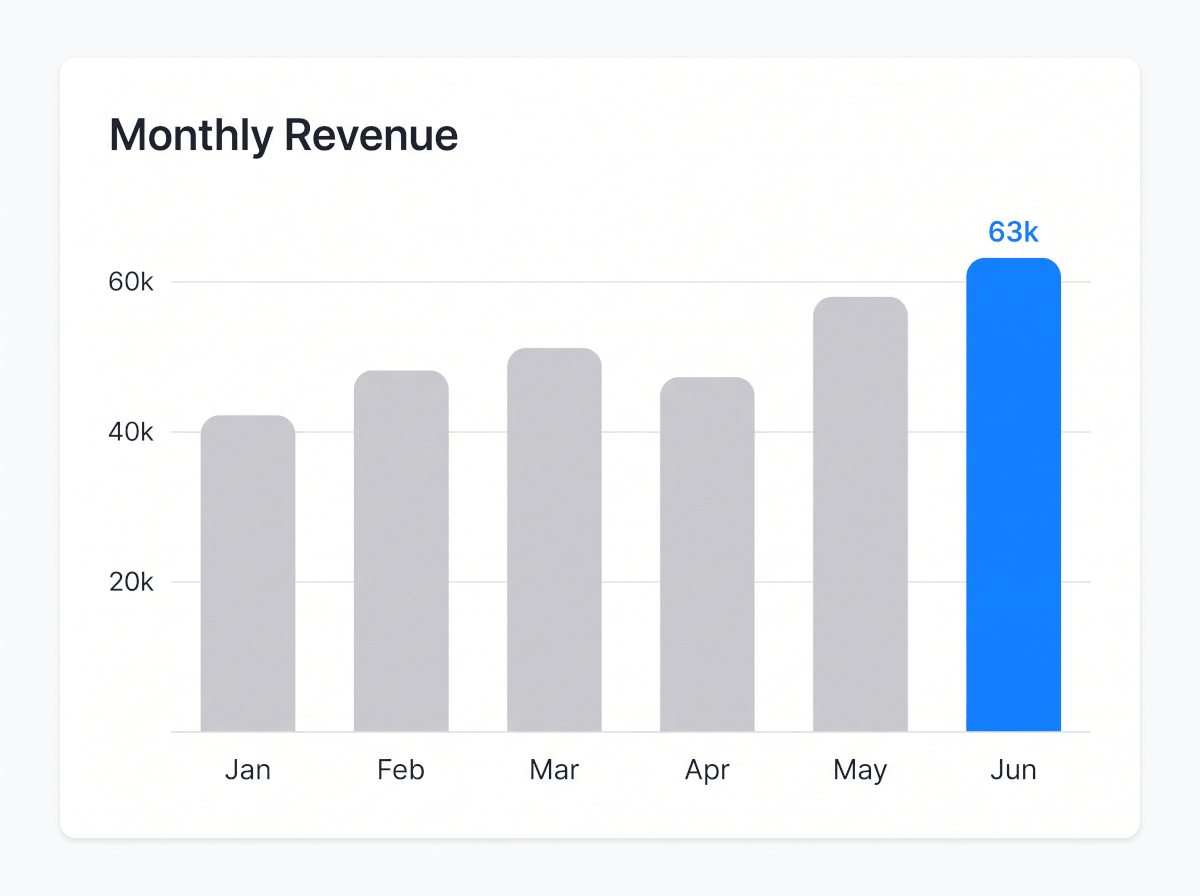
A bar graph maker for comparisons — categories, rankings, before and after. Grouped and stacked bars included.
Line graph
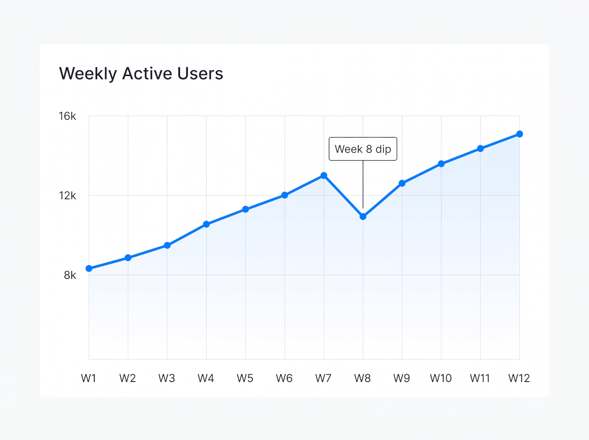
The line graph maker for trends over time — revenue, traffic, anything with a date axis. Multiple series welcome.
Pie chart
A pie chart maker for composition — budget splits, market share, survey answers. Doughnut variant included.
Histogram
A histogram maker for distributions — response times, order values, test scores — with sensible bins picked for you.
Scatter plot
A scatter plot maker for correlation — price vs. rating, spend vs. return — with an optional trend line.
Gantt chart
Describe phases and dates, and the Gantt chart AI lays out the timeline for you — overlaps, milestones and all.
Radar chart
A radar chart maker for multi-criteria comparisons — feature coverage, skill assessments, product scoring.
Heatmap
A heatmap generator for intensity across two dimensions — activity by hour and weekday, or performance by region.
Made with the AI chart generator
Three real outputs — each started as a sentence or a pasted table, nothing more.

How to make a chart with AI
Three steps between your data and a chart you can present.
1Describe it or paste your data
Type what you want to show, or paste rows straight from a spreadsheet or CSV export. No formatting needed — the AI reads it as-is.
2The AI builds the right chart
It picks a fitting chart type, scales the axes, labels the series, and applies a clean style. Want a different type? Just say so.
3Refine, then export
Change colors, labels, or the chart type in place. Export as an image or PDF, or send the chart into a slide deck for your next presentation.
Built for real-world data
The parts that usually eat your time — handled.
Paste from anywhere
Spreadsheet rows, CSV exports, or numbers buried in meeting notes — paste them raw and the chart generator sorts out series, labels, and units.
No data yet? Describe it
Sketch the shape of what you expect and the AI drafts the chart with placeholder values you can swap for real numbers later.
Restyle without redrawing
Switch a bar chart to a line graph, recolor a series, rename an axis — one instruction, no starting over.
Export where work happens
Download charts as images or PDF, or keep them editable inside a slide deck and share a live link with your team.
Frequently Asked Questions
What chart types can the AI chart generator create?
Bar and column charts, line graphs, pie and doughnut charts, histograms, scatter plots, Gantt charts, radar charts, and heatmaps. Name the type in your prompt, or describe the data and let the AI pick the best fit.
Can I paste data from a spreadsheet?
Yes. Copy rows from Excel, Google Sheets, or any CSV and paste them into the prompt box. Headers are read as series and axis labels automatically, and you can rename anything afterwards.
How does the AI decide which chart fits my data?
It looks at the shape of your data: values over time suggest a line graph, parts of a whole suggest a pie chart, category comparisons suggest a bar graph. You can override the choice at any point by naming the type you want.
Can I edit the chart after it's generated?
Yes — the output is an editable chart, not a static image. Update the numbers, recolor a series, relabel axes, or switch the chart type entirely without starting over.
Can I use the charts in a presentation?
Yes. Core chart types — bar, line, pie, scatter, radar — land as editable slide elements, so you can grow a single visual into a full deck and export it as PPTX or PDF. Specialty visuals like heatmaps and Gantt timelines are generated as crisp graphics you can drop into any slide.